I worked on this case study during Memorisely UX/UI Design immersive online Bootcamp. During the Bootcamp I worked with a small team designers around the world. The goal of this case study was to…
| ROLE | Tools | Timeline |
|---|---|---|
| User Research | Figjam | 5 weeks |
| Product Strategy | Typeform | |
| UX Design | Figma | |
| UI Design | Maze | |
| Prototyping | ||
| Usability Testing |
To help me better frame any problems with the product, I began by forming some questions and observations I have about the product. To easily document these I followed the structure [situation], [response], [problem to business or experience] to ensure I’m aware of users and business needs.
When [something happens], users [do something], which causes [problem]
When [users are creating a new project], Users [might wonder how to add a follow up question after describing the mission], Which causes [them to spend extra time figuring out how to add a follow up question], We believe that [users should be able to clearly add a follow up question to the mission block and ]
When [users are creating a new project], Users [have to choose to either test a prototype and are prompted to insert a link], Which causes [users to either click on one of the application icons or either paste a link.] We believe that [instead of having a “where to find this link” hyperlink – we should include a small step by step process in the white space below (as a dropdown menu)]
We believe that [improving the mission blocks in Maze]
For [UX Researchers and Product Managers]
Will [improve their understanding of using Maze for usability testing and therefore increase the speed of setting up test which in turn will increase the number of users for Maze]
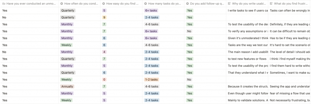
To confirm my observations and begin forming a hypothesis backed by data, I created a user survey to uncover the core problems with the product that I could prioritise for user and business needs.
Having shared my survey with users of the product, the next stage of my case study was focused on synthesizing the data to recognise trends and form a hypothesis. During the synthesis I segmented user responses and used and affinity map to prioritise the problems of users inline with business needs.
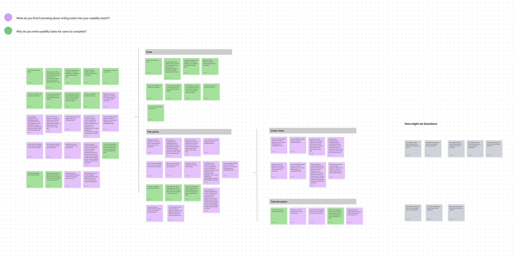
When [users are trying to test a prototype to check the usability], users are [often confused on how to add tasks and questions and follow up questions], which results in [frustration and a lot of time to understand how creating a user test in maze].
With a picture of the problem at hand starting to come into place, we jumped into the ideation phase and worked through the solution design model, identifying users actual behaviour, and optimal behaviour. This allowed me to form a how might we statement to begin forming a solution.
How might we make it easer for Maze users to add follow up questions to tasks?
How might we help Maze users to add questions that aren’t leading?
How might we make it easer for Maze users to add tasks that fit the prototype?
How might we make it easer for Maze users to avoid dead Ends in prototypes?
How might we help Maze users to create briefings and tasks?
How might we help Maze users to make sure they did not miss anything?
How might we help Maze users to ask the right questions?
How might we help Maze users to set the right level of detail?
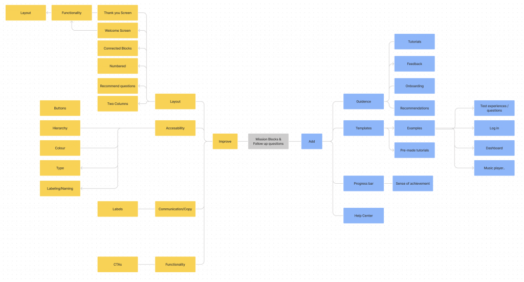
To avoid following the first idea I conducted a series of ideation techniques. This allowed me to consider an array of solutions. Following ideation I mapped what could be improved or added to the product
To inform the user flows I created a user story to ensure each user flow I created had a goal
As a [Enter User Segment], I want [Enter Goal], so I can [Enter outcome].
As a UX Researcher, i want to test prototypes as fast as possible, so i can collect some insights to improve my prototype.
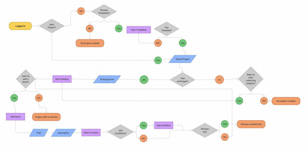
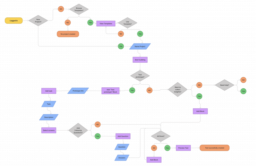
I used a neutral color palette to avoid any decision bias and would use this prototype to get feedback internally. I used Autoflow in Figma to help me easily map the user flow between each page ahead of converting the pages into a prototype.
The lo fi prototype helped me recognize frustrations with the experience that I improved at the hi fi stage. To create the high fidelity prototype I inspected the products style and followed the 8pt rule to effectively and easily create a prototype that was consistent with the product styling. Before creating the prototype I defined styles and components to easily and quickly help me design consistently
Below is the final version of the prototype that I created. I included interactions and transitions from Figma to match the products flow.