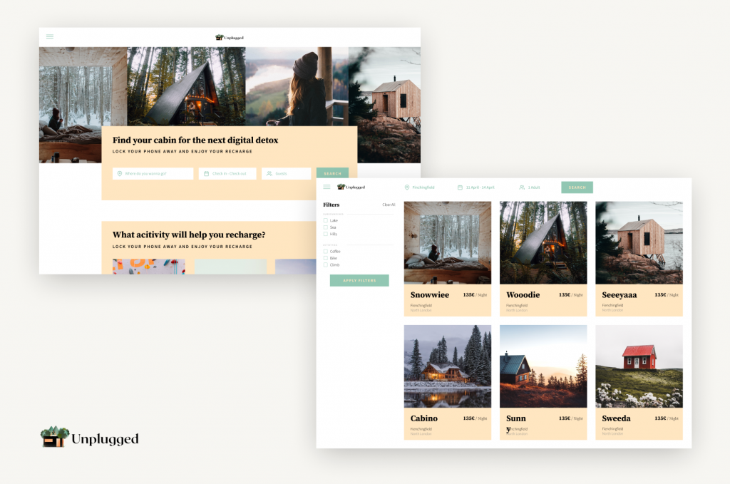
I worked on this case study during Memorisely UX/UI Design immersive online Bootcamp. The goal of this case study was to improve the search experience of Unplugged.
| ROLE | Tools | Timeline |
|---|---|---|
| User Research | Figjam | 5 weeks |
| Product Strategy | Typeform | |
| UX Design | Figma | |
| UI Design | Maze | |
| Prototyping | ||
| Usability Testing |
When searching for cabins, users currently filter through a series of drop-downs to find a cabin. It’s not obvious for users which months are available and ideally, they’d like more flexibility when searching and booking a cabin.
When a user wants to search for a cabin, they can only search by location which restricts the user from filtering through content that is most relevant to their preferences.
To solve the latter, I have adapted the website to match the classic booking platform in terms of layout, navigation, and hierarchy.
When it comes to functionalities, the changes were strictly limited to the search such as adding filters and improving the information architecture of the pages.
To help me better frame any problems with the product, I began by forming some questions and observations I have about the product.

Main Observations
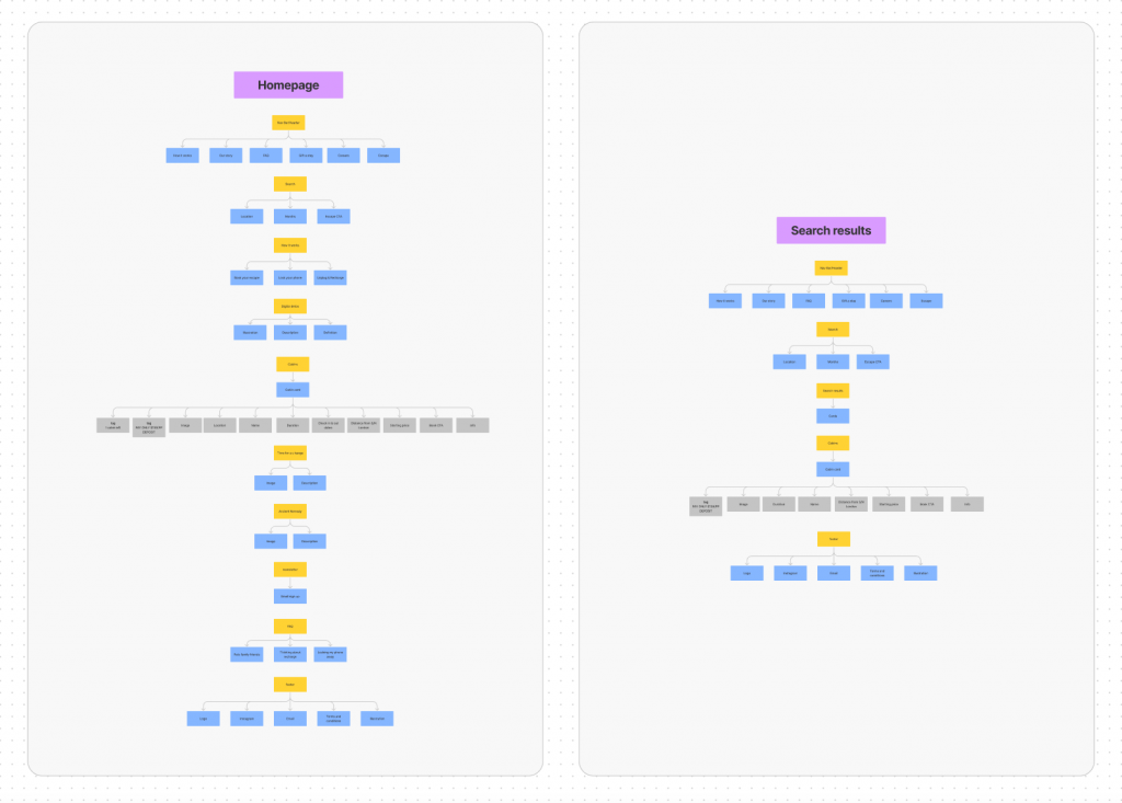
To begin, I mapped out the existing Information Architecture to uncover any pain points related to the search experience on Unplugged.
Following IA, I created a customer journey map to empathise with users and understand the coire problems users experienced at different phases of their journey
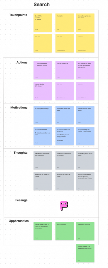
When landing on unplugged users are forced to learn this unfamiliar booking experience which increases the mental labor & the drop risk.
With a picture of the problem at hand starting to come into place, I jumped into the ideation phase and worked through the solution design model, identifying users’ actual behavior, and optimal behavior. This allowed me to form a how might we statement to begin forming a solution.
How might we help busy office workers in the city find a cabin with a lake close by?
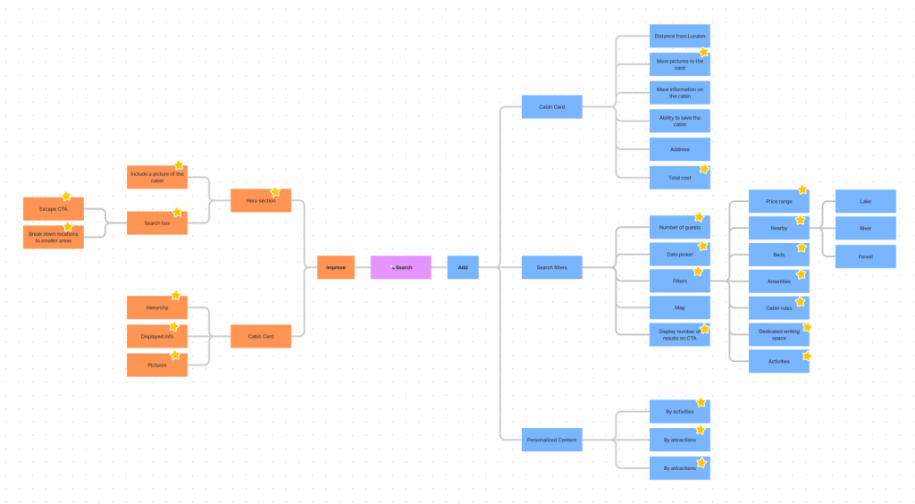
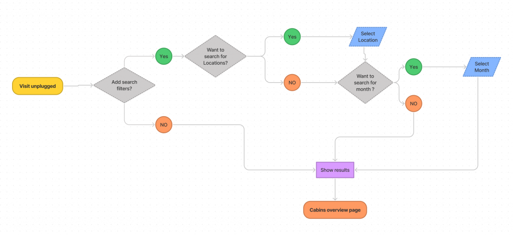
To avoid following the first idea I conducted a series of ideation techniques. This allowed me to consider an array of solutions. Following ideation I mapped what could be improved or added to the experience.

The lo fi prototype helped me recognize frustrations with the experience that I improved at the hi fi stage. To create the high fidelity prototype I inspected the products style and followed the 8pt rule to effectively and easily create a prototype that was consistent with the product styling. Before creating the prototype I defined styles and components to easily and quickly help me design consistently
Below is the final version of the prototype that I created. I included interactions and transitions from Figma to match the products flow.